


The industry default for polo logo placement is the left chest, measured within a range down from the left shoulder seam, with the design centred a typical distance from the centre placket. Keep the logo width moderate and proportional to the garment size. Never approve a bulk run before checking a pre-production physical master sample against these measurements on the actual garment, thread and backing you intend to use.
TL;DR:
- Precise measurement and a pre-production sample are crucial to ensure consistent logo placement, especially given fabric shrinkage and garment variations.
- Vertical placement should be roughly 5.5 to 8 inches from the shoulder seam, with adjustments for women’s cuts and smaller sizes to maintain visual consistency.
- Keep logo width between 3 and 4 inches on the chest to avoid crowding or loss of detail, and specify size-based placement variations in orders.
- Embroidery is the most durable decoration method for chest, sleeve, and collar logos, but complex designs or multi-colour artwork are better suited for print or transfers.
- Detailed, exact placement specifications and thorough sample approval prevent costly mistakes and misalignment in large orders.
Table of Contents
- What is the industry standard for polo logo placement?
- How do you adjust logo placement across sizes and genders?
- Which decoration method suits which placement?
- What is the correct workflow to specify and approve a logo placement?
- Which placement suits your industry and role?
- How does Cwear’s experience shape these recommendations?
- An editorial view on getting logo placement right
- How to get a sample or quote for your polo programme
- Sources
- FAQ
What is the industry standard for polo logo placement?
Left chest is the default for a reason. It sits in the natural eyeline during a handshake, a till transaction, or a photograph, and it reads clearly at conversation distance without overwhelming the garment. But “left chest” is not a single point. It is a small zone, and where you land within it changes how the logo reads on the body.
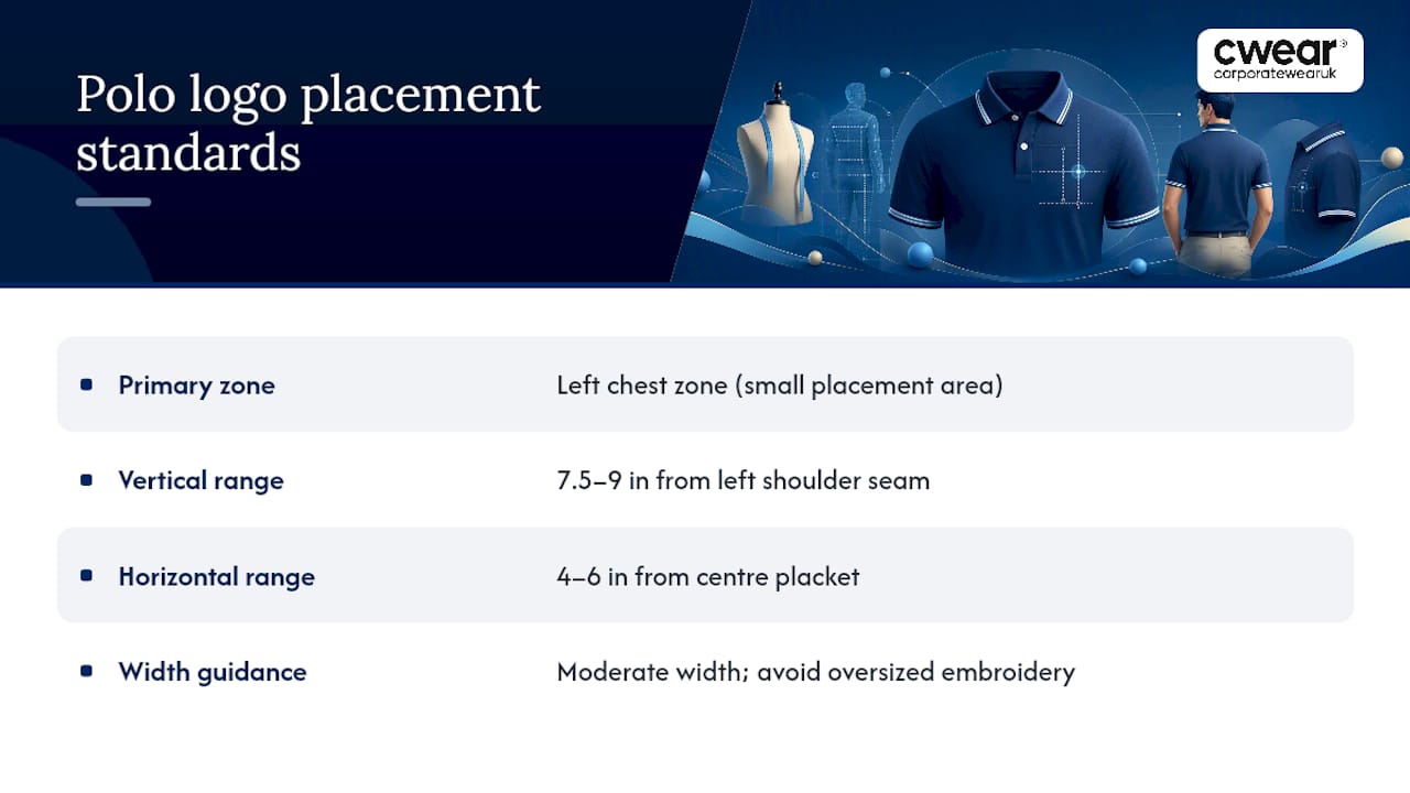
The standard measurement runs a moderate distance down from the left shoulder seam, with the horizontal position a typical range from the centre placket. Some placement guides tighten that vertical range further, citing 7.5 to 9 inches from the shoulder seam and 4 to 6 inches from centre as the working figures for polo-specific placement. The variation between sources reflects garment cut more than disagreement. A slim-fit polo and a relaxed-fit polo of the same size will still put the logo in slightly different visual positions even at identical measurements, because the fabric drapes differently across the chest.
Width matters just as much as position. A commonly cited sweet spot for a chest logo width is moderate, and most digitisers recommend not exceeding a certain width for embroidered chest work to maintain good proportions and avoid crowding smaller sizes.
How to measure it on the garment
The most reliable technique, sometimes called the “crosshairs” method, uses two fixed reference points rather than guessing by eye:
- Find the horizontal centre by measuring the distance between the placket edge and the side seam, then halving it.
- Measure down from the shoulder seam, not the collar, since collar styles vary between suppliers and sizes.
- Use the placket itself as a straightedge to check the design sits parallel to it, not tilted.
- Mark the design centre point on the actual garment before hooping or pressing, not just on a digital mockup.
- Cross-check the finished position against a second sample from a different production batch, since fabric shrinkage during pre-treatment can shift things slightly.
This measuring approach, drawn from size and placement guidance for left-chest embroidery, removes most of the guesswork that leads to mismatched placement across a bulk order.
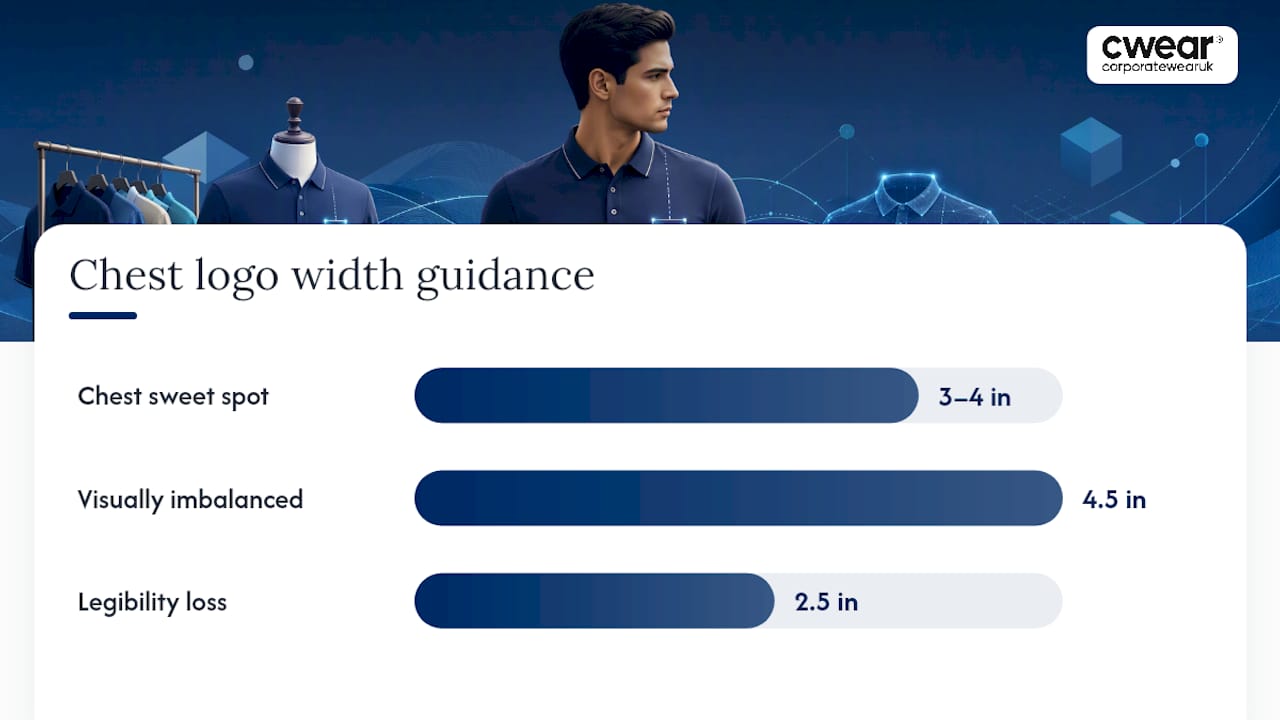
Sweet spot for chest logo width: 3 to 4 inches (7.5 to 10 cm). Anything beyond 4.5 inches risks visual imbalance on standard adult sizing, and anything under 2.5 inches tends to lose legibility on detailed logos.
Alternative placements follow their own ranges. Sleeve logos typically run a modest width, positioned on the upper arm for visibility even when covered. Back placements are more flexible, covering a range of sizes depending on the required visibility distance. Both ranges come from practical logo placement guidance for polo shirts, and both sit well outside the tighter tolerances that govern chest work.
How do you adjust logo placement across sizes and genders?
A logo that sits perfectly on a men’s medium can look strangely low on a women’s small or oddly high on an XXL, because body proportions and garment cut change faster than most order forms account for. Getting this wrong is one of the most common reasons a bulk order comes back looking inconsistent once everyone is wearing it side by side.
Raise the vertical placement moderately on women’s cuts compared with the men’s standard. Women’s polos tend to sit differently across the bust and shoulder, and a straight port of the men’s measurement usually reads as too low on the body. This adjustment, backed by placement guidance specific to left-chest embroidery, is one of the simplest fixes procurement teams skip when they treat men’s and women’s specs as identical.
Scaling across sizes needs the same discipline. A rough rule is to shift placement slightly per size increment, so the logo maintains a consistent visual height across sizes. Without this, the logo creeps proportionally higher on larger sizes and lower on smaller ones, simply because the garment itself is longer or shorter in the torso.
Youth sizing needs its own target width to keep the logo proportionate on smaller chest panels without overwhelming the garment.
Slim-fit and stretch fabrics introduce a smaller but real variable. These fabrics pull tighter across the body, which can make a standard placement measurement sit slightly differently once worn compared with how it measures flat on a table. A small downward or inward nudge, checked on a worn sample rather than a laid-flat garment, usually resolves it.
Pro Tip: Specify size-based placement variants in your purchase order rather than one fixed measurement for the whole run. A single spec line reading “5.5 in / 14 cm down, 5 in / 12.5 cm from centre, scale ±0.5 in per size band” gives your supplier everything they need without back-and-forth.
A short procurement checklist for a mixed-size, mixed-gender order should cover:
- Base placement figures for the standard adult men’s size (usually a medium)
- Women’s vertical adjustment (+1 inch / 2.5 cm)
- Youth width target (2 to 3 inches / 5 to 7.5 cm)
- Scaling increment across the size run (approximately 0.5 inches / 1.3 cm per size)
- Any additional adjustment for slim-fit or stretch fabric ranges
Which decoration method suits which placement?
The decoration method you choose does not just affect cost. It dictates which placements will actually hold up, and which ones risk warping, cracking, or fraying after a handful of washes.
Embroidery is the strongest choice for chest, sleeve, and collar placements, and it is the most durable option across repeated laundering, which matters for workwear that gets washed weekly rather than occasionally. It struggles with fine detail, however. Very small text or intricate gradients tend to blur together once stitched, so a logo with delicate line work often needs simplifying before it goes anywhere near a chest position.
Screen print and heat transfer handle the opposite problem well. They suit large back placements and complex, multi-colour artwork that embroidery would either flatten or make prohibitively expensive to digitise. The trade-off is that both methods behave less predictably on piqué knit than on a flat cotton tee, since the ribbed texture of piqué can cause a transfer to sit unevenly or crack at the ridges over time.
Stabiliser and backing choices sit behind most placement failures that only show up after the fact. Getting stitch density and backing wrong is the leading cause of puckering, particularly on chest placements where the fabric has less structure to resist the pull of dense stitching. A cutaway or tearaway backing, matched to the fabric weight, prevents the fabric from distorting around the design. Readers digitising their own artwork, or briefing a supplier on it, can find a useful primer on stabilisers and stitch density before committing to a chest placement on lightweight piqué.
Cost and lead time follow placement fairly predictably: chest embroidery is typically the fastest and most economical option per unit at volume, while large back prints with multiple colours carry longer setup time and higher per-unit cost, especially on short runs.
What is the correct workflow to specify and approve a logo placement?
Specifying placement clearly on paper is only half the job. The other half is verifying it physically before a few hundred garments arrive with the same mistake baked in.
- Write the placement into the purchase order in exact figures, not vague terms. State the vertical distance from the shoulder seam, the horizontal distance from the centre placket, the logo width, and the size band each figure applies to.
- Request a pre-production physical master sample made on the same fabric, with the same backing, thread, and digitisation file that will be used for the bulk run. A digital mockup cannot show you how stitch density will behave on piqué knit.
- Run a wash and dry cycle on the sample before signing off. This is the only reliable way to catch shrinkage, thread bleed, or puckering that will not show up on a fresh, unwashed garment.
- Inspect visually for puckering and check colourfastness after the wash cycle, comparing the sample against the original artwork file for colour accuracy and edge definition.
- Align production using fixed reference points: use the shoulder seam for vertical measurement, the placket as a straightedge for horizontal alignment, and mark the design centre on the physical garment before hooping or pressing.
A pre-production sample is not a courtesy step your supplier offers to be helpful. It is the only reliable way to confirm a design will not shift, pucker, or fade before you commit to a full production run, according to guidance on maintaining visual consistency in branded output. Skipping it to save a few days on turnaround is the single most common reason bulk orders come back needing correction.
Pro Tip: Ask your supplier to photograph the master sample against a ruler laid flat on the garment before they ship it for approval. It gives you an instant visual check on the exact measurements without waiting for the physical item to arrive.
Which placement suits your industry and role?
Placement decisions change depending on what your staff actually do while wearing the garment, and how far away the people who need to see the logo usually are.
Left chest remains the default for corporate and client-facing roles. Reception staff, account managers, and anyone in regular face-to-face contact with customers benefit from a subtle, professional mark that reads well at close range without dominating the shirt.
Trade and workshop staff often do better with a sleeve placement or a smaller chest mark. Hand gestures and tool use during the working day naturally draw attention to the arms, so a sleeve logo gets noticed without needing to be large.
Event and promotional staff usually need visibility from further away, which is where back placements earn their keep. A design in the 8 to 12 inch (20 to 30 cm) range on the back reads clearly across a exhibition hall or festival site in a way a 3 inch chest logo simply cannot.
Sports and teamwear programmes tend to combine both: a chest crest for identity and a larger back print, often a name or number, for visibility during play. Complex back graphics with multiple colours or gradients usually favour print over embroidery for this reason.
Common placement mistakes worth flagging before an order goes to production:
- Logos sized too large for the chest panel, crowding the collar or side seam
- Placement set too close to the collar, making the design look like it is climbing off the shoulder
- Placement set too close to the placket, throwing the design off centre
- Chest logos positioned near the underarm, which distorts badly when the wearer moves
How does Cwear’s experience shape these recommendations?
These figures are not theoretical. These measurement ranges have been tested against real fabric, real stitch counts, and real wear-and-wash cycles rather than a single flat mockup.
Having embroidery and printing capabilities means placement, digitisation, and stabiliser choices are managed in a coordinated way rather than passed between separate suppliers, reducing the chance of a mismatch between what was approved and what gets produced. Orders typically involve a sample and artwork approval step before bulk production begins, which mirrors the pre-production master sample workflow described above. There are options for garments designed to balance branding requirements against sustainability goals.
For readers looking for a starting garment that suits standard left-chest placement, the Essential unisex short sleeve workwear polo shirt and the 65/35 Classic piqué polo shirt are both common choices for corporate programmes running mixed-size, mixed-role orders.
An editorial view on getting logo placement right
Most placement advice online treats logo position as a design choice. It is not. It is a procurement problem dressed up as a design problem, and treating it that way is where most orders go wrong.
The conventional advice tells you where a logo “should” sit, in vague terms, and stops there. What actually matters is whether that position survives translation into a purchase order with exact figures, a supplier who can hit those figures consistently across fifty or five hundred units, and a wash cycle that does not undo the whole thing. A 3 inch chest logo described only as “left chest, medium size” gives a supplier nothing to work from. The same logo specified as “6 in down from shoulder seam, 5 in from centre placket, 3.5 in wide” leaves almost no room for drift.
What buyers should prioritise first is not the perfect placement figure. It is building the approval workflow that catches a bad figure before it reaches five hundred garments. A pre-production sample, washed and checked before sign-off, will save more money than any amount of debate over half an inch of vertical placement.
— Vinay
How to get a sample or quote for your polo programme
If the figures above have you ready to move from spec to sample, the process starts with a request rather than a guess. The ordering process typically includes approval of a pre-production sample and artwork mockup before anything goes to bulk production, allowing review of the exact placement on the garment before committing to a full run.

Eco-friendly fabric options are available for programmes balancing branding needs against sustainability targets, and dedicated customer support is on hand to help translate the measurements in this guide into a workable order spec. If you are outfitting a client-facing team, the Nike polo golf primal print slim works well as a chest-placement starting point, while the ladies’ short-sleeved polo shirt covers the women’s adjustment discussed above. For teams that need a more casual secondary option alongside the polo range, the Stripe Jersey tee is worth a look. Request a sample, approve the artwork, and check the placement on the physical garment before it goes anywhere near a bulk order.
Sources
The Stahls placement guide covers general chest measurement ranges and alignment references. The ApparelLots technical guide details wash and dimensional stability testing for master samples. For patch-based branding, Lee Embroidery offers further detail on embroidered patch alignment.
- Design placement tips
- How visual consistency creates brand trust
- Left chest embroidery size & placement guide
- The ultimate guide to perfect logo placement on polo shirts
FAQ
Where should a logo be on a polo shirt?
The standard placement is the left chest, measured 5.5 to 8 inches (14 to 20 cm) down from the shoulder seam and 4 to 6 inches (10 to 15 cm) from the centre placket.
Which way should a polo logo face?
The logo should sit upright and parallel to the placket, using the placket edge as a straightedge reference so the design does not tilt when the garment is worn.
How far down do you place a logo on a shirt?
For chest placement, measure down from the shoulder seam rather than the collar, landing between 5.5 and 8 inches (14 to 20 cm) depending on the garment size and cut.
How do you put a logo on a polo shirt?
Specify the exact placement in centimetres or inches on your purchase order, then approve a pre-production physical master sample made with the same fabric, backing, and digitisation before signing off on bulk production.
What is the recommended logo width for a polo shirt?
The commonly cited sweet spot is 3 to 4 inches (7.5 to 10 cm) for adult chest logos, narrowing to 2 to 3 inches (5 to 7.5 cm) for youth sizing.


